YOU ARE HERE... HOME >> ARTICLES >>
Designing Logos For Print
One of the first things to consider when starting a logo project is the output types that are required. Will the logo be used on the web? Will it be printed on letterheads? Does it also have to be printed billboard size?
Personally I'm against limiting designs in this way. I find that giving my Biz-Logo.com clients a logo that will work in all possible applications saves time and headaches later on - for the designer and for the client.
1. Print-Ready Formats
Printers do not all use the same format. Most of the time an AI (Adobe Illustrator) or EPS (Encapsulated PostScript) will do. Some printers require a PSD file (Photoshop) and some require a CDR (CorelDraw) file.
Most graphics applications like Corel allow the user to export the file to just about any format. Don't be stingy when it comes to formats. Give the client more formats than he or she will ever need. It costs nothing and saves hassle later.
2. Color Depth
There are two basic types of color printing:
- Full-color printing (more expensive)
- Spot color printing (less expensive)
FULL-COLOR PRINTING
Flip through any glossy magazine to see examples of full color printing. Full-color prints are done with 4 inks, each one requiring its own pate. The four inks are Cyan, Magenta, Yellow and Black (CMYK).
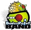
A full color logo like this one:
Would be split into CMYK channels like this:


The amount of black on each shows how much of that ink will be printed. When the four inks are printed over each other in these amounts, the colors blend visually to create the full-color logo.
SPOT COLOR PRINTING
Spot color printing uses one to four inks. The fewer inks, the less it costs. Most printing presses are one, two or four-color. This means that a three-color logo will often cost more or less the same to print as a four-color logo, because it is run through a four-color press with one empty ink well.
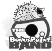
A two-color logo like this one:

would be far cheaper to print than the full-color logo above, provided that it's printed in spot color.
In spot color printing, colors are identified using the PMS (Pantone Matching System) model.
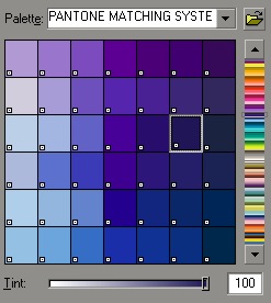
The logo designer can either design in Pantone colors from scratch, or convert the colors to Pantone at the end of the process. The problem with the latter is that the closest matching Pantone color may not be 100% the same as the color in the original design.
Logo designers should, except with full-color designs, give the client the names/numbers of the Pantone colors as this is something the printer would need.
3. Gamut!
Ever seen the words "Gamut warning" before?
I won't go into why it's called Gamut (because I don't know why). Let's just focus on what it means...
A gamut warning means that one or more of the colors in a design is not attainable in CMYK. Most graphic programs like Photoshop and Corel have little warnings (typically a yellow triangle with an exclamation mark) that shows when you select a color that is not attainable in CMYK.
4. Fonts
Most designers have a gazillion fonts installed on their computers. The problem is that printers, even though they may also have a gazillion fonts installed, might not have the font used in a design. Logo designers should therefor either convert fonts to curves or, if copyright allows, send the font files with the logo. Always check if a font is copyrighted before you share it with your customer.
<< Back to article index
<< Back to homepage